I did some work last year for a podcast (which has since grown into a larger family of entertainment) called The Chance Cube, based around the card game Star Wars: Destiny.
The first project was a t-shirt design, using their slogan "Don't leave your destiny to chance..."
We started out with a selection of rough designs in different fonts, but I also included one in there where I'd hand-lettered "DESTINY" with a folded pen.
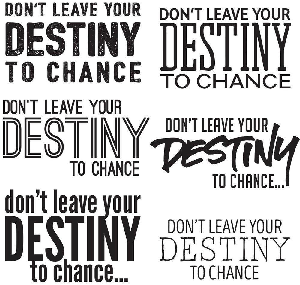
For any science-fiction item, I tend to lean toward sans-serif fonts (though I did use a couple of more casual serif fonts in there, so that we got a feel for lots of different options). I did go for choices more on the condensed side, which is a change from the usual extended sans-serifs we see all over the place for sci-fi work.
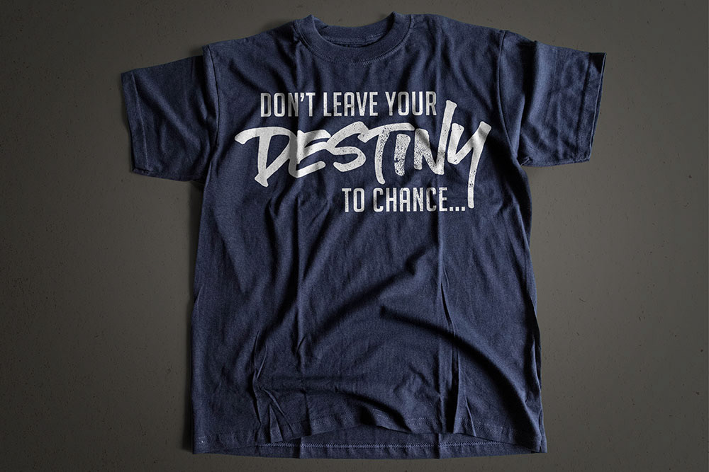
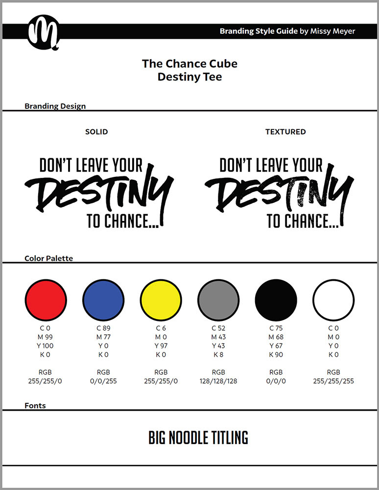
The client decided to roll (pun intended) with the hand-lettered design, supported by the font Big Noodle Titling. We moved on to refinement and adjustments, and also did two versions - one clean and solid, and another with some distressing applied. Here's a sample of the distressing:
For the final delivery, our friends at The Chance Cube received files in multiple formats and colors, as well as a branding guide. (The red/blue/yellow color scheme is theirs, taken from their original logo.)
If you're interested in this tee, you can grab it in a number of color options at The Chance Cube's Teepublic page!
I also worked with The Chance Cube team on a logo for The Chance Cube Open, an event where folks who were going to the Star Wars: Destiny world championships could warm up, socialize, and test out their decks.

We started out with a number of sketches, several of which had an "award" feel to them. The detail along the edge of the circular sketch would mirror the detail lines around the cards in the game.
I also developed one that had an award-style look, but also used their cube logo in combination with a circle to echo the shape of the BB-8 droid from The Force Awakens.
The winner was the BB-8 style design, so we proceeded to finalizing the design, and working up various color options based on the same primary color scheme as the cube logo.

After revisions to the color options, and the addition of some shading to the cube, we had our final versions, presented below. Both CMYK and RGB color schemes are specified, since the logo would be used on both printed merchandise and on the event website.

The Chance Cube was a great team to work with, and it's always nice to get a sci-fi based project. I'm a big fan of Star Wars (I'm part of the crowd who loved The Last Jedi), so it was great to work with others who also love that galaxy far, far away.