This was a logo and corporate branding project I did as part of graphic design school. WonderPop isn't a company that actually exists -- it's a company I made up for one of my novels. It's a kids' software company, and seemed like a fun item for this student project.
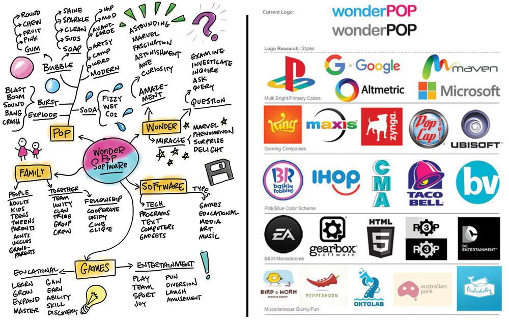
The first steps included working up a brief (I'll spare you that large document full of text, and skip to the colorful pictures), followed by a mind map (left) and research into other logo styles (right).
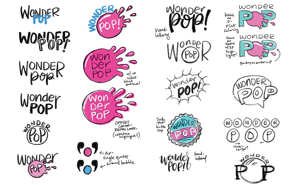
From there, I moved on to rough ideas and sketching. Many of these leaned into the idea of a popping bubble.
The choices were narrowed down to two, both of which used the popping-bubble idea. Further sketching and refinement followed:
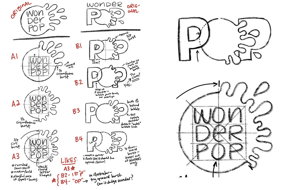
Since both finalists included the popping bubble, I moved into Illustrator to create them both. I started with the stacked letters inside the bubble, since once I had the bubble created for that, I could take it and modify it for the option where it takes the place of the O in POP.
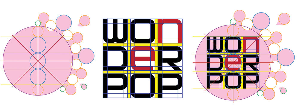
You'll hear designers talk about grids and alignment a lot, but they really are handy. Especially with the font I used, I opted to add a bit more playfulness by replacing the uppercase N and E with lowercase, and had to size and scale them to fit with the rest of the letters. Thanks to the grid, I was able to match line weights and curves.
There are a lot of circles here, too. They're actually based on Fibonacci numbers -- the green circles are 1 unit high, the yellow circles are 2 units high, the blue circles are 3 units, and the large bubble is 13 units.
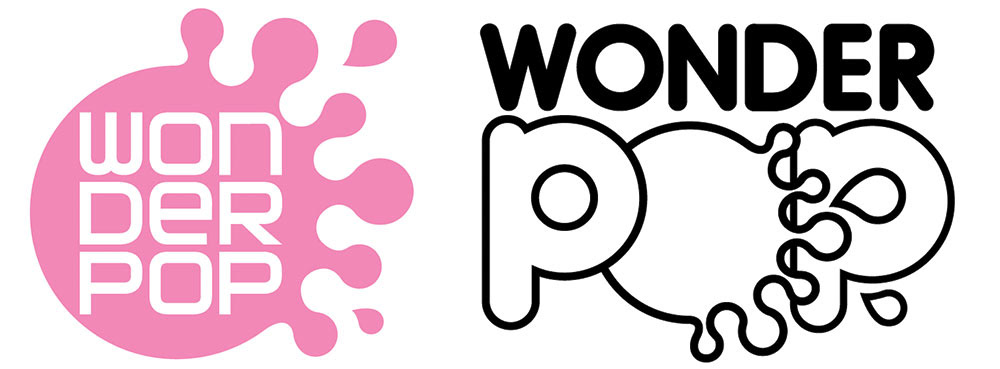
Once the bubble was completed, we could move it over to the second finalist. I really liked how the large droplet replaces the counter in the second P of POP, but I don't like how the splashes of the bursting bubble overlap with the spine of that P. It makes that one area too busy in an otherwise simple design.
Decision made: the version with the stacked text is the winner!
There were some color and formatting decisions to make, testing out the colors used in the previous logo (that the company wanted to keep, for consistency).
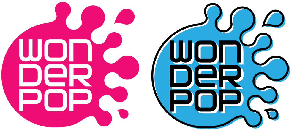
I tried out both solid, and an outline version with an offset color. The offset version is cool in its own way, but it tends to clutter up a relatively simple and clean logo.
Final presentation time!
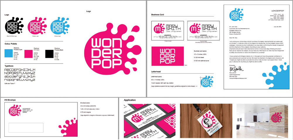
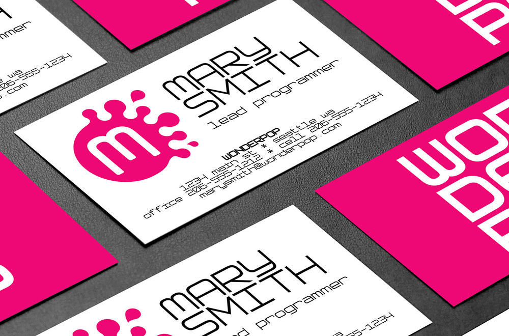
First up is a full sheet detailing the logo, color options, and fonts used. (This font is Software Tester 7, bulked up a bit to make it more bold.) Then samples of business cards (front/back), as well as letterhead stationery and a #10 envelope. Last up were a set of mockups showing the logo in action:

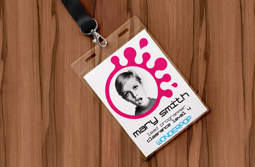
(This lady on the mocked-up ID badge came with the mockup. I could have put another face in there, but her expression delighted me.)
So there you have it, a student project developing a logo and corporate branding package!