Welcome to another of my student projects from design school, where I'll show you the stages and the final product for a product packaging and branding exercise.
The product I chose for this exercise was a line of craft beers geared toward tabletop gamers.
First up, research into existing craft beer branding, and the competition
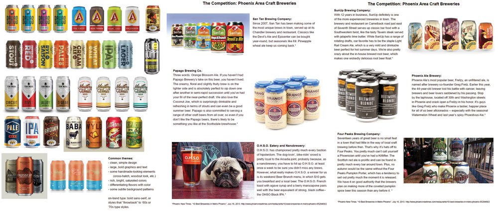
If you didn't already know that craft beers are showing up in cans just as often as bottles these days, now you know! There's a real boom in colorful, simple designs, which worked perfectly for me.
Next up, sketches and color/layout ideas for bold gaming-related icons for each beer flavor.
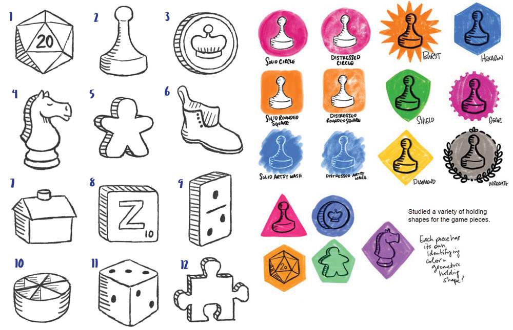
The icons are unified by their consistent line weight, angled view, and woodcut-style lines for shading. Next up, expanding the color schemes and layout for cans:

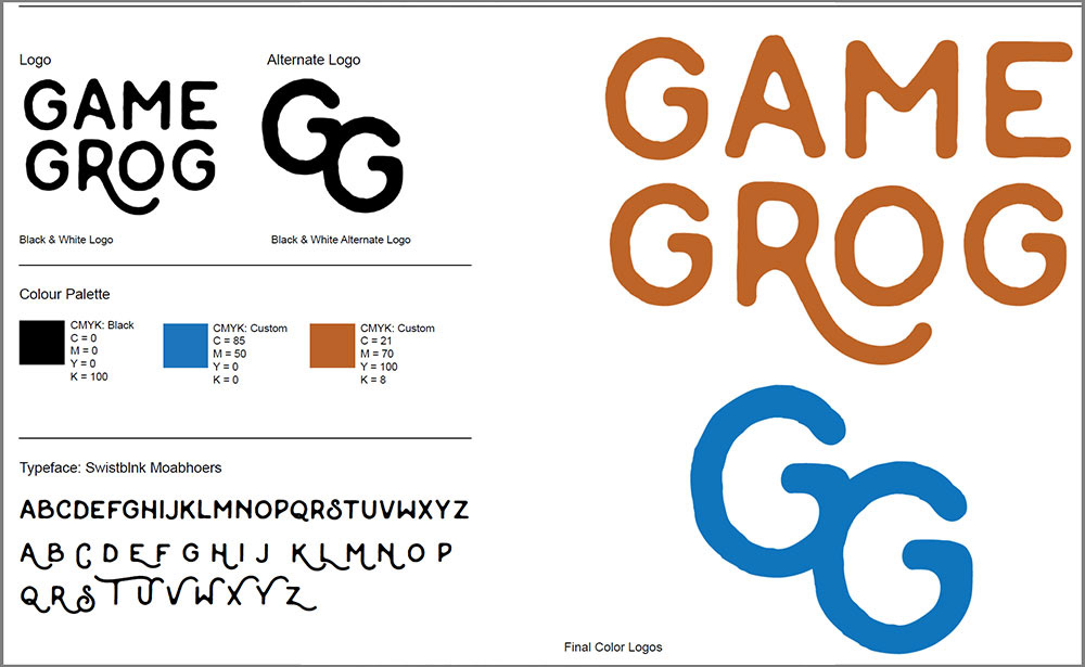
It wasn't necessarily a part of this exercise to come up with a new logo, but since it's a made-up brand, I made up a logo as well. I opted to use Swistblnk Moabhoers for the font, going for that rustic, woodcut look that's also popular with the hipster crowd these days.
After a set of color schemes and general presentation was decided, it was time to build the layout. Time to break out the grids and circles!
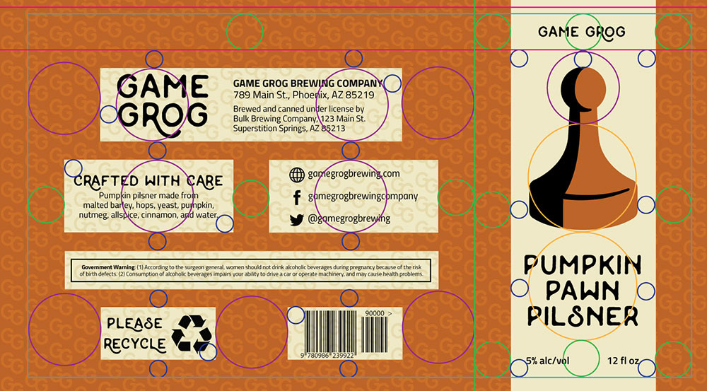
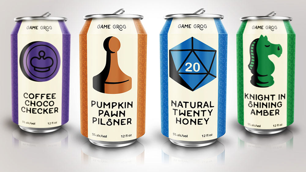
And once the base layout is complete, we can replace each icon and flavor name, and change the color scheme. (Note: in the final icons, I didn't use the woodcut-style lines for shadows. I wanted them to be a little less busy, so I went with black sections of shading instead. Though the chess knight got to keep the lines in his mane.)
Note, there's also a pattern of the "GG" alternate logo to the background. Subtle, but it gives a lot more depth to what could have just been wide areas of solid color.

And then come the mockups, because I love making mockups. (As anyone who's a follower of my fonts may have guessed.)

This was an all-around fun project. I got to stretch my legs on creating a set of icons, a logo, and packaging. Plus, I got to do a tiny bit of humorous writing for the beer flavor names!