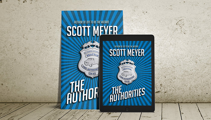
This is the cover of Scott Meyer’s first comedy detective novel. Most of it is pretty straightforward — a starburst, some typography, and a grungy layer over the top to give everything a little bit of texture.
The main element is the badge in the center. I started out creating all of the outline shapes in Illustrator (for the outside edge, I created one side and then copied and flipped it so it’d be perfectly symmetrical). Then I moved them over into Photoshop and ran some bevel, emboss, and shading effects.

The inner parts (van lines and windows, bee eye, all of the text) got the same treatment, but with the lighting coming from the 180° opposite angle. That’s what makes those parts look like cutouts. In studying actual badges, they usually have a texture to the background, and the text parts are filled in with glossy enamel. I created a custom Photoshop texture (in my mind, I think of it as “LEGO nubs”) for the background, and changed the text from gray to blue.
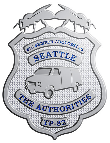
(If you haven’t read the book, all I can say is: a van, bees, and the designation TP-82 all figure into the plot.)
A little more work with shading and light, and it was ready to go!

Title and author typeface: Big Noodle Titling by Sentinel Type
Badge typeface: Bookman Old Style by Monotype
Hero image mockup: Covervault