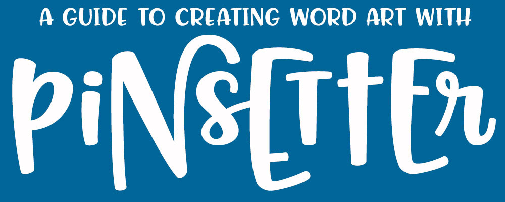
Hello, friends! I've had a number of people ask me for advice on how to lay out specific words and phrases using my Pinsetter font -- with six options for each letter, it can be hard to choose what works best. So I figured I'd make a guide with some hints on how to get the most out of the font!
If you've looked at the Pinsetter promo images over at the font's main page (where you can also find all of the shops where it's available for purchase), you can see a few things I've created with the font. For a couple of them, the text was set on a curve, but for the most part, I just typed a sentence out in one line, then changed letters one by one until I liked how they looked.
To get started, let's take a look at the letters available in Pinsetter:

The base alphabet is the "Littles." The uppercase and lowercase letters are, for the most part, the same height, so they can be mixed and matched and switched around.
The "Middles" alphabet consists of larger versions of the Littles. They're a bit taller and a bit wider, but they aren't just resized versions -- they all have their own individual quirks.
Then you have the "Talls." These letters (sans-serif for the uppercase, serif for the lowercase) are sized and adjusted specifically so that they cradle the Littles:
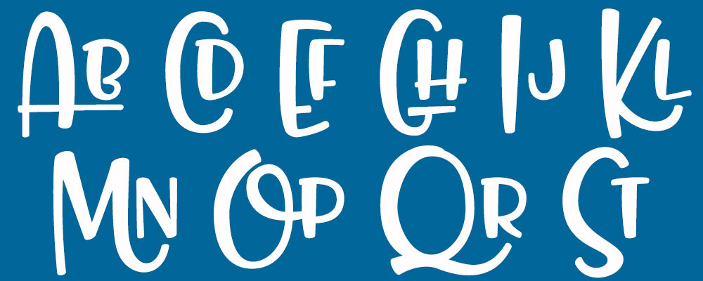
Every Tall can be followed by every Little, and they'll fit great. This is one of the big features of Pinsetter -- you can always follow a Tall with a Little, and you'll get a fun result.
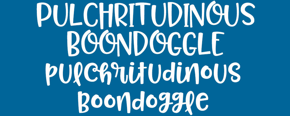
Now, let's take a couple of words, and lay them out in the different sizes:

First up, we have Littles in uppercase on the top, and Littles in lowercase on the bottom. Some people prefer to just use one alphabet, and not mix and match sizes. You can still mix and match between the uppercase and lowercase, however! That way, you still get a fun hand-crafted look, but your letters are all the same height, which is important for some layouts.
Note: "Pulchritudinous" means "physically beautiful," and "boondoggle" means "work of little or no value done merely to look busy." Which is kind of the end result I'll be shooting for! :)
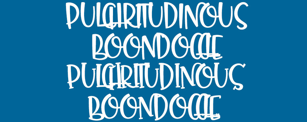
Now, let's take a look at just the Middles:
Again, this works just fine on its own! And if you mix and match between the uppercase and lowercase, you can get some great variety while keeping your work at a constant height.
So how about those Talls? Can they be used on their own?
Not really straight out of the box, no. Since they were designed specifically to cradle the Littles, the Talls don't necessarily work well on their own.
Which is not to say they CAN'T be used on their own, but I'd only advise doing it if you type the letters out one by one, each on their own, and then use a careful hand to arrange them. If you just type them out on a straight line, then add spaces between them so they don't overlap, your work won't look that great.
Now, let's look into creating work that mixes the three sizes together! There are a few ways you can go. I'll start with the easiest:

The simplest thing you can do is apply a regular pattern. In this example, I've gone with Little, Middle, Tall (and then repeated throughout). This pattern gives you a Little right after every Tall, which is a guaranteed way to get the letters to work well together.
I've done this pattern in only uppercase, so adding in some lowercase here and there will give you even more variety. But when in doubt, going in size order 1-2-3, 1-2-3 (like a font waltz) will almost always give you a good result.
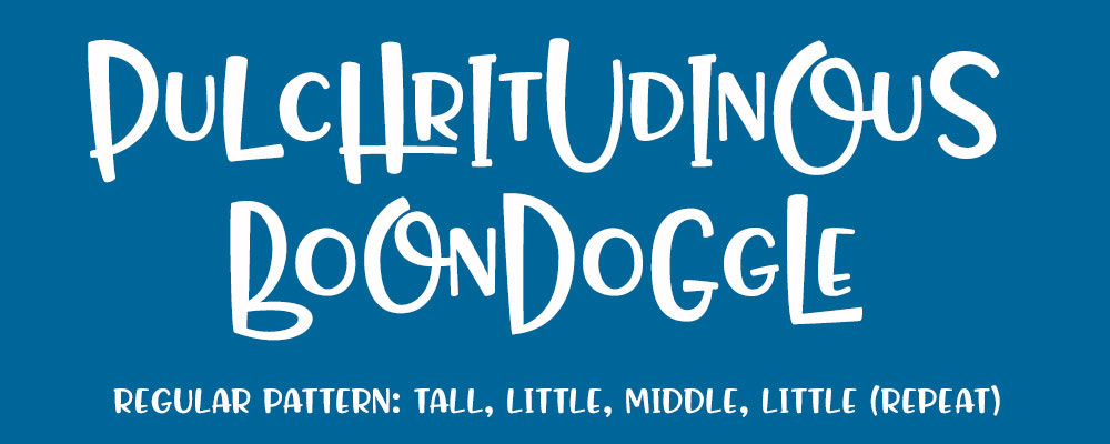
Here's another pattern you can try: Tall, Little, Middle, Little (repeat). Once again, it puts a Little after every Tall, so you get some good letter-snuggling.
I, personally, don't like this pattern quite as much as the previous one, primarily because there are too many regularly-spaced Littles in there.
I don't mind that 50% of the letters are Littles here -- my issue is that the Littles happen too predictably. It's totally OK to be way off-balance on what sizes you're using, you just don't want it to be THIS obvious that half of your letters are in one size. The constant up-down bounce makes things less smooth.
(If you are going to have way more of one size than the other two, I recommend using more Middles. Because of their medium size, they flow more smoothly into both the Talls and Littles, so they can act really well as bridges between other letters.)
Now, it's time to strike out and go without a pattern! We're going to do our resizing randomly, just going by what feels good.
Let's start by typing the words out in Littles, to give us a solid base to work from. From there, we'll pick a few letters that look particularly fun as Talls, and change the size on those:

It's a good start! I'm not going wild with the Talls -- just a few for emphasis.
With my Talls decided, I know that I'm going to leave every letter AFTER a Tall as a Little. You don't have to do that; you could put a Middle after a Tall if you wanted to. But the Littles fit so darned well after the Talls, I'm not going to mess with it.
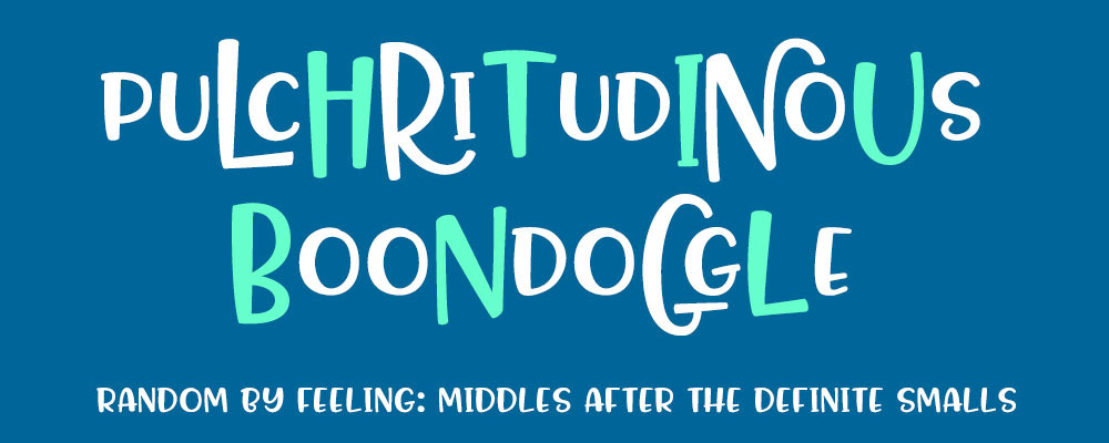
As a sort of echo to the first pattern (Little-Middle-Tall) we looked at, I'm following all of those Tall-Little combos with a Middle. It just seems like the obvious move.
I've also added in a couple of extra Middles (that second I in pulchritudinous, and the B and N in boondoggle) to break up the rest of the field of Littles.
We're getting there, but we aren't done yet. There are still too many Littles in there, and everything's still in all uppercase. So next, we're going to change some things to lowercase, and look at changing a few more of those Littles to Middles.
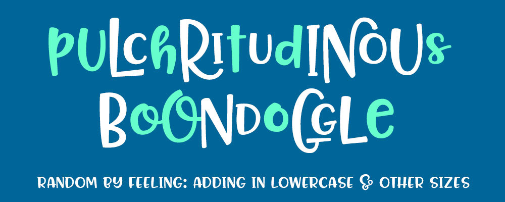
Here are a lot of changes!
On the top row, every letter in green has been changed from uppercase to lowercase. Also, the P, U, and D were all changed from Littles to Middles.
On the bottom, I've lowercased two of the Os and the Es, and changed several of the letters (the second two Os and the E) into Middles.
Generally, I've tried to keep from having the same letter appear twice. Even though there are four letters O in this pair of words, every single one of them has a different appearance. That's something that will help get a hand-crafted look to your piece.
NOW, we're going to step up one more level of difficulty: we're going to take a word, and type the letters out one at a time, then arrange them all by hand. (Remember, if you're planning on using all-Talls, you'll definitely need to do this.)
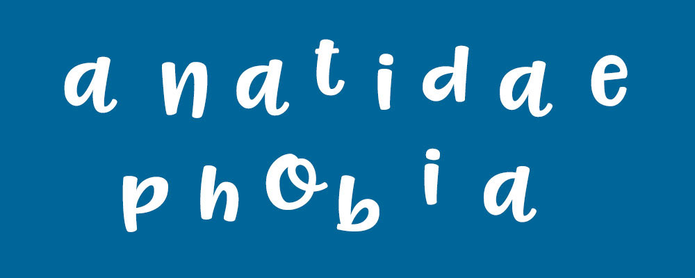
let's start with another fun word, typed out plain in uppercase Smalls:

This word may have existed before, but it first came into my consciousness when Gary Larson used it in a Far Side comic back in the '80s. The internet says he coined the term, so I'll roll with that.
Now, let's take the letters and type them out one by one. I'm doing these images in Photoshop, so each letter will be on its own layer:
I've started with them all as lowercase Smalls, but few of them will remain that way. One by one, I'll be changing either the case, the size, or both.
Even though it's more labor-intensive, there are a couple of big benefits of laying out your text this way. For one, you don't have to depend on my spacing or alignment -- you can make things spaced farther apart, closer together, or higher up/lower down. Secondly, since you're working on the letters one at a time, you can really put some thought into how each letter follows the last, and tinker around until you get a really nice fit.
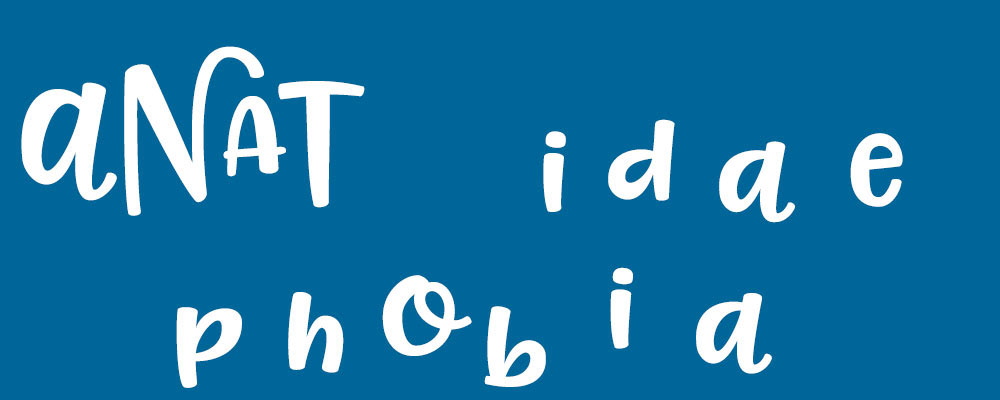
I decided to start with a lowercase Middle A. From there, I went with the uppercase Tall N -- I just really like the way the N sweeps over the next letter. I knew I wanted a Little to follow the Tall, but since I'd just used the lowercase A, I switched this A to uppercase so it'd be distinctly different. I followed that up with a Middle uppercase T, but I scootched it down and in so it, like the N before, helped to cradle the A.

Continuing on, I went with the lowercase Middle I, and followed that with the lowercase Tall D. I moved that I in close enough so that its tail flowed smoothly into the stem of the D.
I didn't need to follow this particular Tall with a Little, but I'd only used one Little so far, so I went ahead and went with the lowercase Little A. It's far enough away from that first A that things don't look like they're repeating. Then, because I tend to use more Middles than the rest, I went with a Middle E.
Now that you see what I'm doing, I'm going to knock out the "phobia" part:
I did quite a bit of nudging things up and down in the final product: in "phobia," I moved the P up, and I moved the O downward so that its tail entered the B at the same angle as one of the strokes in the B. It's a little thing, but it adds just that little touch of unity between the letters.
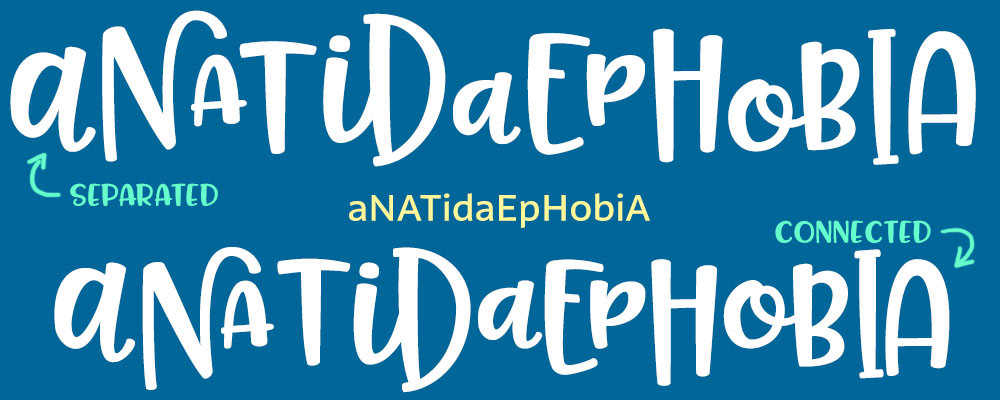
For comparison, I've moved the word I just worked on (with all of the letters typed separately) to the top, and then re-typed the word all on one line at the bottom. The bottom one isn't bad! But the top one just has a little bit more unity, a little better flow. (For reference, I've put the final capitalization scheme in the middle. It ended up with 6 uppercase and 8 lowercase, which is close enough to 50/50 for me. :)
So there you have it! A few helpful hints to get you started working with my Pinsetter font. If you have any specific questions, or want some advice about laying out your particular word or phrase, feel free to drop me a line! You can get in touch via the Contact page here at the site, or you can send me a message over at my Facebook page. And I'd love to see what you do with the font!